Google, we need to talk.
Google is the provider for most of the services I use. I use Gmail, Google Calendar, Google Reader and a bunch of other services they provide. Chrome has become my go to browser lately.
Recently, they have been making some interface changes. Some good. Some bad.
First the good news.
The look is different. Since most of the apps had never received a UI refresh, it was time.
Now the bad news.
I’m not sure the designer of the interface actually uses any of the products.
This person/team needs to reminded of a few of things:
1. My computer is not a smartphone.
Ninety-five percent of my browsing is done on a laptop with a very large monitors. I don’t mind tablets and smartphones; they have their place. But I want a full featured browsing experience when I’m not using a mobile device. The Ipad’s interface is ingenious and simple, but that doesn’t mean it should be everywhere.
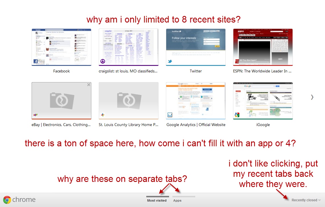
Google Chrome’s new tab page now sucks as a result of some Googler thinking they need to make it behave like a smartphone or a tablet. The old New Tab page was extremely useful because it gave a heads up view of my apps, recent closed tabs and most visited pages. It was VERY handy. The new tab page, not so much.
(Photo apology: Sorry for the scrunched images. Click on them to see them full size.)Now I have to scroll between two tabs to see apps and most visited pages. Awful and a lot less useful.
The fix: I’ve seen suggestions to install an old version and turn off updating. So not really a fix.
My wish:
- Allow apps on the Most Recent tab.
- Allow more than 8 recent sites
- Put the Recently Closed back where it belongs
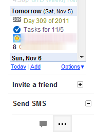
The left navigation of Gmail also suffers from this. I’d prefer to see my chat and widgets in one long window. Why do I now have to click a button to see who’s online, or my calendar widget?
2.White space is not the new black.
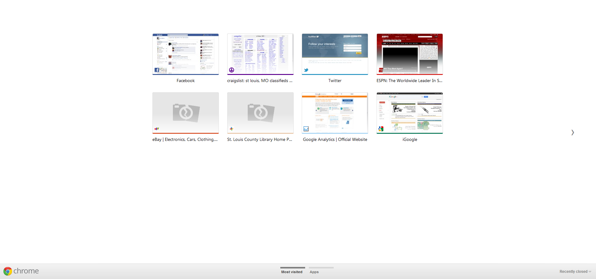
I don’t need extra whitespace between detail items just for the sake of having white space. Yes it makes the UI look cleaner. But it wastes a bunch of screen real estate and impacts the usability of the product.
The Chrome screenshot above is good example of purposeless white space. Here’s the image above, but at near full screen.
Google Reader is the biggest victim of this. After the update, I found myself clicking “Mark All As Read” a lot more frequently than normal as I couldn’t focus on the spaced out items. Maybe I’m weird, but I have seen a couple posts on large nerd sites in the past few days soliciting suggestions for the best RSS Reader after the UI updates, so I don’t think I’m alone in this.
I did find a userscript that will help with this Google Reader spacing issue. You can find it here.
New Google Reader without userscript (7.5 items)
New Google Reader with userscript (11 items)
3. Provide a fallback plan
The most maddening thing of all these changes is that Google (who when I looked the other day, still provide a way to show the “Gmail – beta” logo) has been really good in the past of allowing legacy features to persist or giving users the option through application labs to enable/disable suspect changes.
The new UI changes seem to have no options or rollbacks.
Facebook is well known for making interface and feature changes that users hate. They seem to think they know best and that we’ll all be better off for their benevolent tweaking.
Until recently, Google has by and large been the anti-Facebook in making changes that collectively enrage their user base. That seems to be changing and is not a good thing.


